
We spend a decent amount of energy explaining that a brand is not just a logo, why keeping it smart and simple is (almost) always the answer. Every client walks in referencing Nike or Target's simplicity, but that is rarely where they end up. We try and guide them without sounding like a bunch of smug designers. We are not always successful. Some folks can't see the difference, and if we can't illuminate the forest for the simplicity then we have failed.
Jeff and I arrived at this idea for this post that serves as an excellent metaphor - Texas' sports. When you see a Longhorn or an Aggies sticker many Texans succumb to a visceral reaction. These marks can flood one with pride, disdain, envy, and a myriad of other emotions least of which is ambivalence.
We understand that a team is different from a brand. However, when one sees a team sticker, they are rarely reacting to the current roster of players, but rather the way that team makes them feel. It's less about wins and losses and more about what the brand and it's accompanying archetypes represent: region, affluence, spirituality, value systems, etc. In many ways, the brand is much more consequential than the team itself.
Ok, so let's get down to the criteria. What makes the best brand? While it's not everything, (1) a strong logo is critical. We often refer to the logo in a broader sense as the identity. The logo is your brand's thesis statement in visual form.
What is the voice or your (2) brand promise? Do people know and understand who you are and for what you stand? If yes, congratulations, that is no easy task. An Aggies' values are assumed, as are a Longhorn's. If you're walking around in that garb, people can and will assume you hold a certain value system.
A (3) third element for longstanding brands is their history and evolution. Where did the brand begin and how has it held up over time? Has it evolved effectively? Or, better yet, has the original brand stood strong throughout time?
Other elements (4) include color, typefaces, secondary imagery and logos and all the elements that make up the visuals for a brand.

5. Houston Astros: 14 make-believe points Logo: 3 of 5 / Voice: 3 of 5 / History: 5 of 5 / Other: 3 of 5 This one was tricky. We could have gone with Texas Rangers on their name alone. But, after their classic name, the Texas Rangers don't measure up in the brand department. The Houston Astros debuted with one of the most timely and unique themes in the history of sports - astronomy! Today it's kind of hilarious, but in the early 60's, there was nothing cooler than space. The Astros played in the 8th wonder of the world while adorning their cosmic unis and being cheered on by their mascot, Orbit. According to the infallible Wikipedia, the uniform was so different from what other teams wore that the Astros wore it both at home and on the road until 1980. The brand is more subtle at this point, but they have reverted to some classic colors, uniforms and a star logo that appropriately represents Houston today. Bonus points for their original name and one of the baddest brands of all time: The Houston Colt .45s.
 4. San Antonio Spurs: 16 make-believe points
Logo: 3 of 5 / Voice: 5 of 5 / History: 4 of 5 / Other: 4 of 5
This is a great example of when the brand is so much more than the logo. In terms of name and logo, we think they are both very good, but this brand has evolved to mean far more. From the outsider's point of view, the Spurs represent discipline, teamwork and a commitment to excellence. I feel I can speak from a vicarious perspective, as some of my best friends call themselves Spurs fans. They see the Spurs as an integral part of the culture of their city. Their pride and loyalty to this team is under appreciated and most similar to more heralded fandoms like the Boston Red Sox or Pittsburgh Steelers. Basically, they're crazy.
4. San Antonio Spurs: 16 make-believe points
Logo: 3 of 5 / Voice: 5 of 5 / History: 4 of 5 / Other: 4 of 5
This is a great example of when the brand is so much more than the logo. In terms of name and logo, we think they are both very good, but this brand has evolved to mean far more. From the outsider's point of view, the Spurs represent discipline, teamwork and a commitment to excellence. I feel I can speak from a vicarious perspective, as some of my best friends call themselves Spurs fans. They see the Spurs as an integral part of the culture of their city. Their pride and loyalty to this team is under appreciated and most similar to more heralded fandoms like the Boston Red Sox or Pittsburgh Steelers. Basically, they're crazy.
![]() 3. Texas A&M: 17 make-believe points
Logo: 4 of 5 / Voice: 4 of 5 / History: 5 of 5 / Other: 4 of 5
Love them or hate them, it's hard to argue that their brand is clearly defined. When I moved to Texas, I was quickly polled on UT or A&M? It didn't matter that I attended an entirely different university. This was about the 12th man, gig 'em and some sort of military branch that I am still not entirely clear on. From their colors to their logo to their gold rings, the only thing stronger than the Aggie brand is their disdain for #2.
3. Texas A&M: 17 make-believe points
Logo: 4 of 5 / Voice: 4 of 5 / History: 5 of 5 / Other: 4 of 5
Love them or hate them, it's hard to argue that their brand is clearly defined. When I moved to Texas, I was quickly polled on UT or A&M? It didn't matter that I attended an entirely different university. This was about the 12th man, gig 'em and some sort of military branch that I am still not entirely clear on. From their colors to their logo to their gold rings, the only thing stronger than the Aggie brand is their disdain for #2.

2. University of Texas: 18 make-believe points Logo: 5 of 5 / Voice: 4 of 5 / History: 5 of 5 / Other: 4 of 5 Perhaps no school has better branding than UT. From their burnt orange and white (voted best school colors by USA Today) to their simple and symmetrical longhorn logo, they are synonymous with Texas. Their brand is so powerful that their rivals adorn their cars and coolers with (I think only A&M fans partake) desecrated longhorn logos. This gesture alone reveals the iconic nature of the UT brand. Now, they just need to start winning again.

1. Dallas Cowboys: 19 make believe points Logo: 5 of 5 / Voice: 5 of 5 / History: 5 of 5 / Other: 4 of 5 So annoying, but so true. They are #1 in Forbes teams valuation list. They are #1 in the world, displacing global giants which include Manchester United and the New York Yankees. This all became dumbfoundingly clear when my wife returned from Dallas two days ago. For those unaware, my wife believes professional sports are dumb. There is no sport that she holds more contempt for than the NFL. She was once quoted saying, "They need to get real jobs."
I was nothing but astonished when I saw Piper walk in with a Dallas Cowboys hat on her head. She had toured the Dallas Cowboys Stadium elaborate art collection, which I'm certain is the least NFL-y thing one can do at Cowboys Stadium. When I repeatedly-pressed her for why she would wear such a polarizing piece of branding, she simply responded, "I like the star. I thought it was cool."
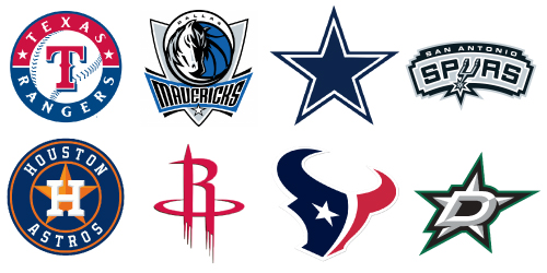
It all comes down to that star. Many brands and teams use it. In fact, it may be the most ubiquitous icon in all of branding. The Cowboys are the only team who use the star on its own. There are no other components. Out of eight of these brands, six of them incorporate a star. The Dallas Cowboys keep it simple and their entire brand utilizes only the star. This goes back to something we all know but are often too afraid to pull the trigger on: K.I.S.S. Keep it simple, stupid. When you look at this group of logos which one stands out? It's easy for your logo to stand out when you're not hiding behind anything.
If you take what we're saying literally, then without the star, their brand would not be the most marketable team in the world. That seems absurd. Maybe it is. It's impossible to know. But, let's try anyway.
Take the Dallas Desperados: same sport, same city, same overall concept. This logo was likely designed by a very talented group of people. The logo itself is far more complicated to create. Now, imagine this is what the Dallas Cowboys started with as their identity. Do you think this logo would have resulted in the same level of global recognition?
The answer is simple.